The Inlet at Seabrook Island
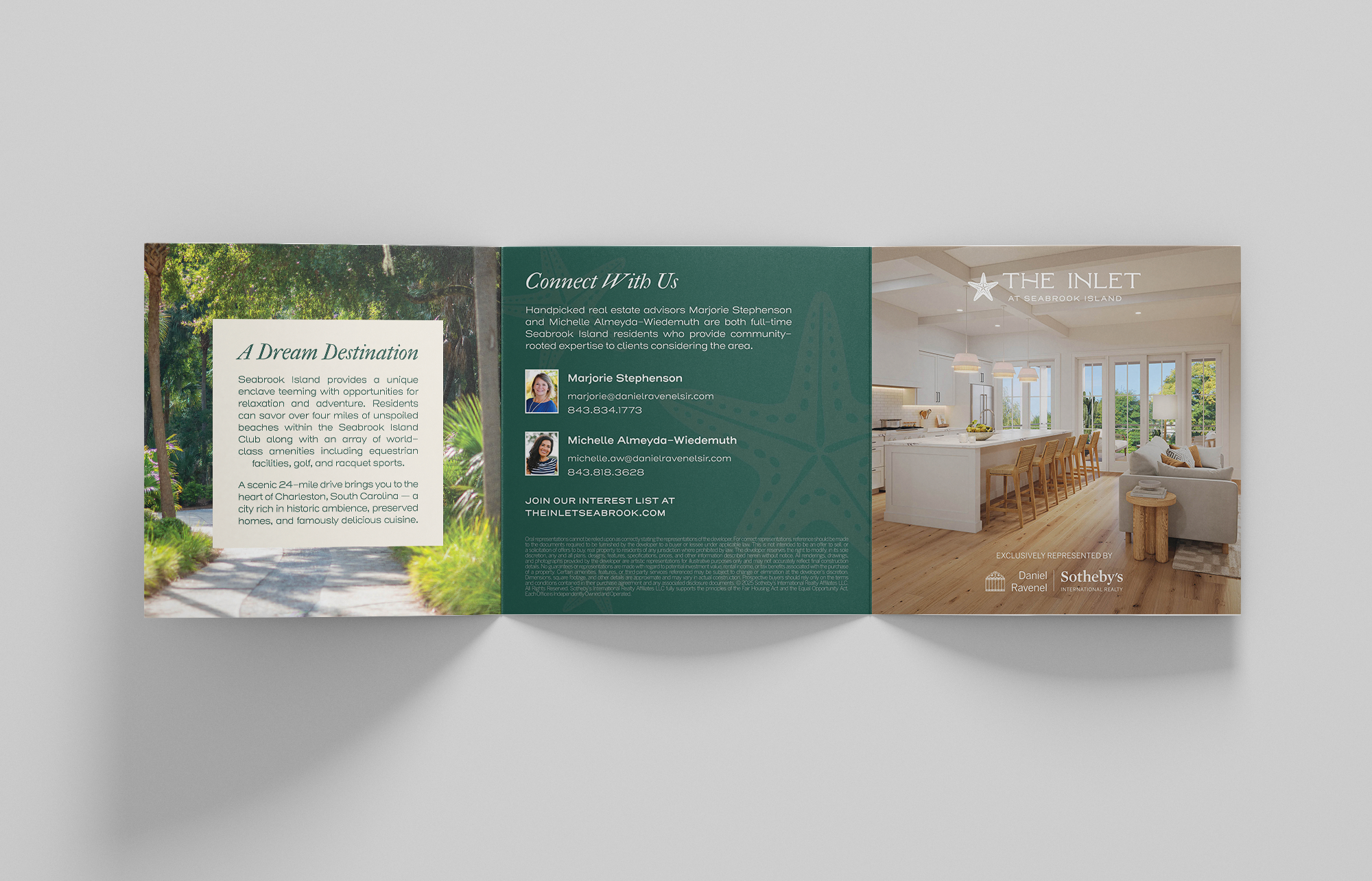
Created as the exclusive visual identity for The Inlet at Seabrook Island, this project centered around building a brand that honors the island’s natural beauty and understated luxury. Developed under Daniel Ravenel Sotheby’s International Realty, The Inlet was envisioned as a refined coastal community designed for comfort, accessibility, and connection.
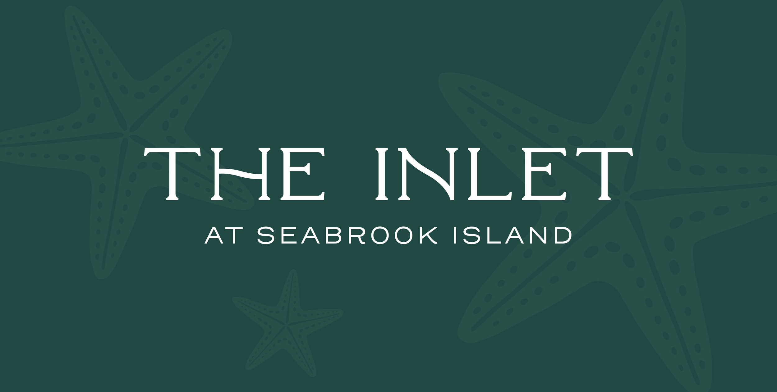
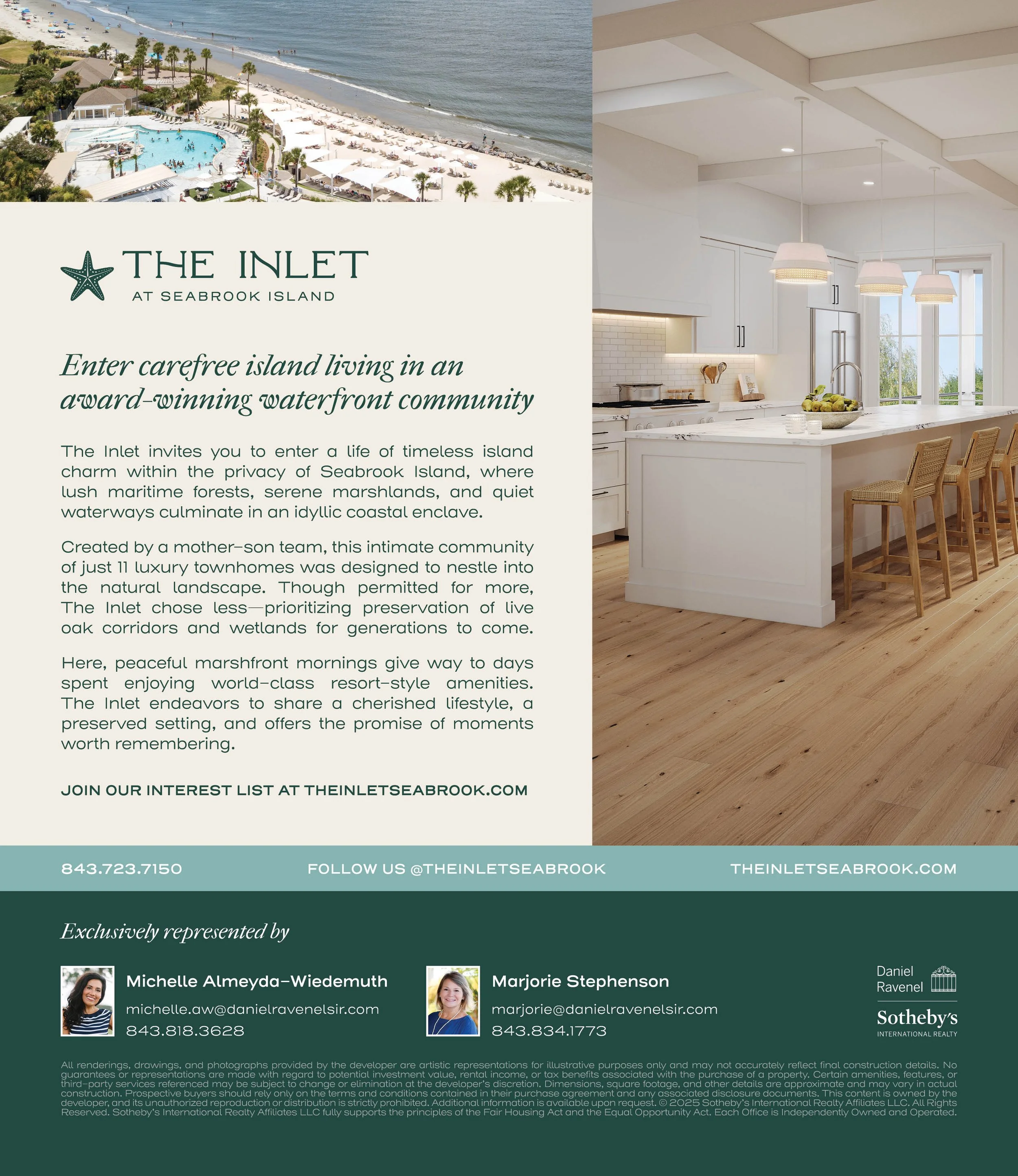
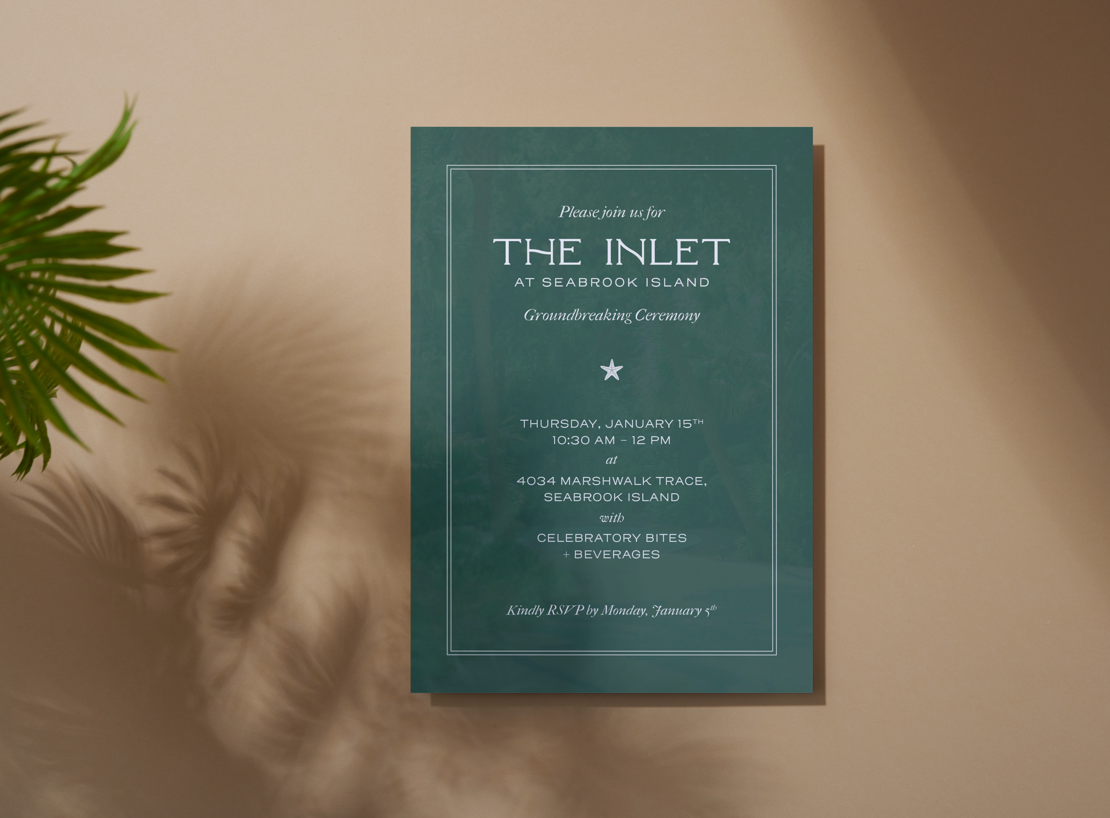
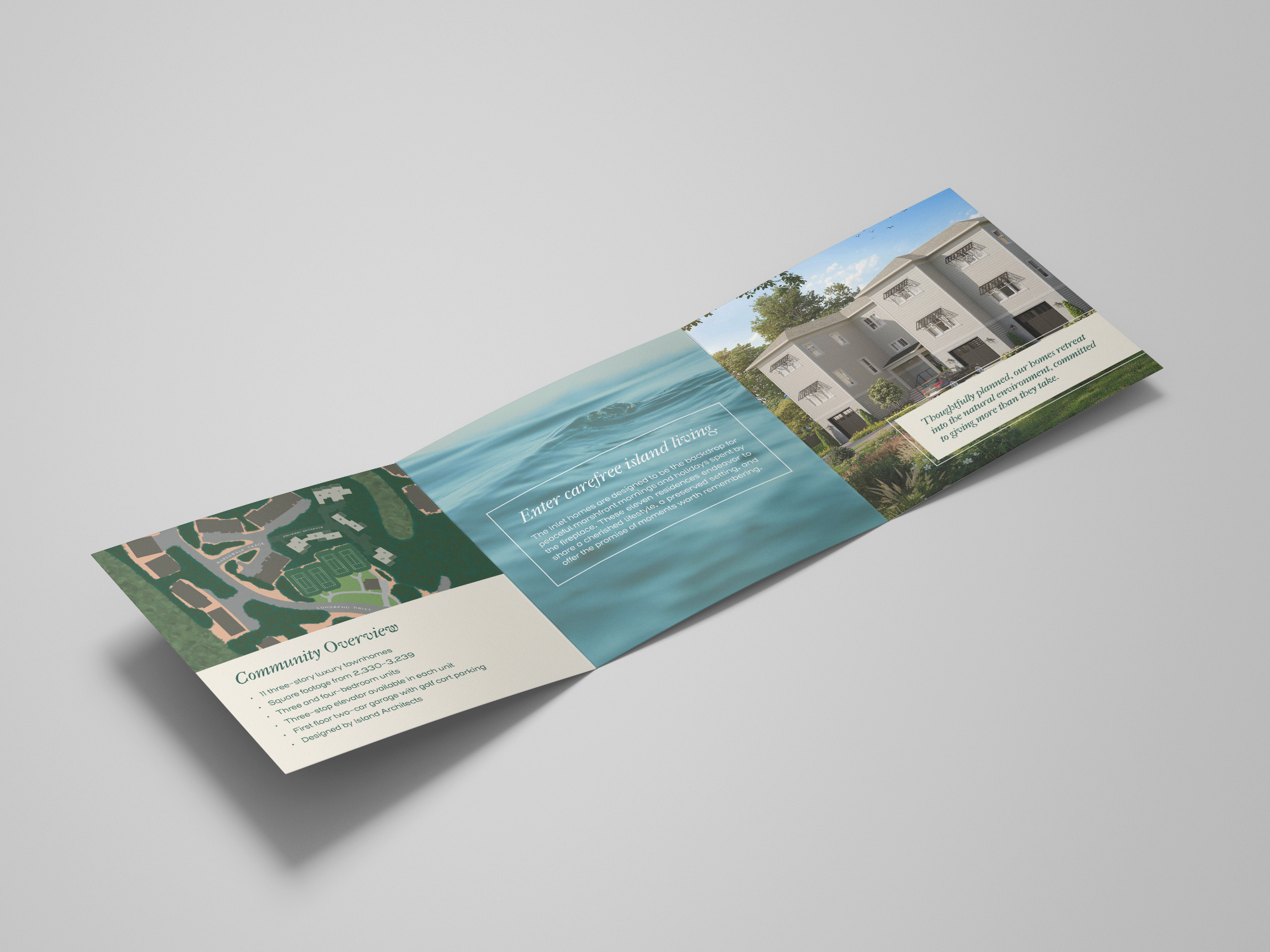
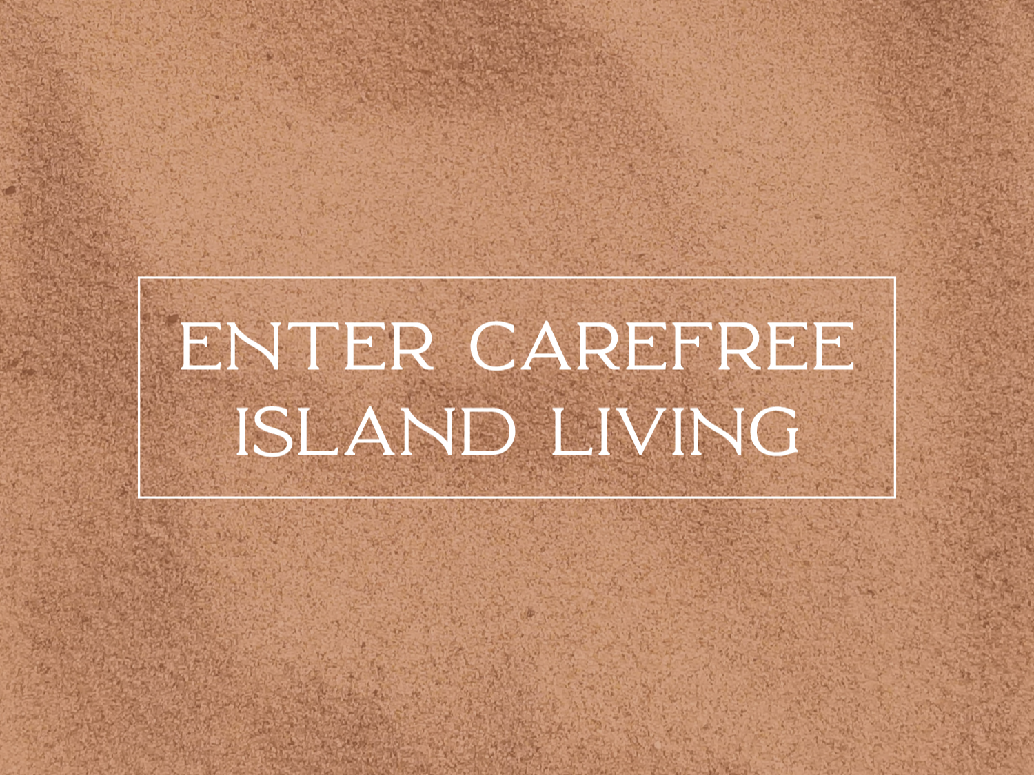
The brand identity was crafted entirely from marketing messaging, translating key themes of inclusivity, ease, and elegance into a cohesive visual system. The typography features soft, rounded letterforms inspired by the gentle movement of water. The color palette is inspired by the natural beauty and relaxed lifestyle that defines Seabrook Island, drawing from the coastal tones found in its landscapes, from the soft turquoise hues of waterways to the deeper teals that echo shady marshes and ocean depth. Subtle neutrals and warm accents evoke comfort.
The focus on environmental beauty was at the forefront of the brand identity, due to the fact that the development was approved to be much larger, but the developers chose to sacrifice and only build 11 townhome units in order to better preserve the neighboring marshlands and tree corridors. Another key aspect of this brand identity was accessibility. Great care was taken to ensure that the color palettes and typography met WCAG standards for contrast and accessibility, supporting enhanced legibility for vision-impaired audiences, given that Seabrook Island’s median homeowner age is 62.
Since The Inlet at Seabrook Island invites people to arrive as they are and experience relaxed, coastal living, the resulting brand identity balances refinement with ease, expressing a sense of luxury that feels welcoming rather than exclusive.