The Power of Timelessness
When Meaning Outlives Trends
Every so often, a logo comes along that feels like it shouldn’t work — and yet it does, sometimes spectacularly.
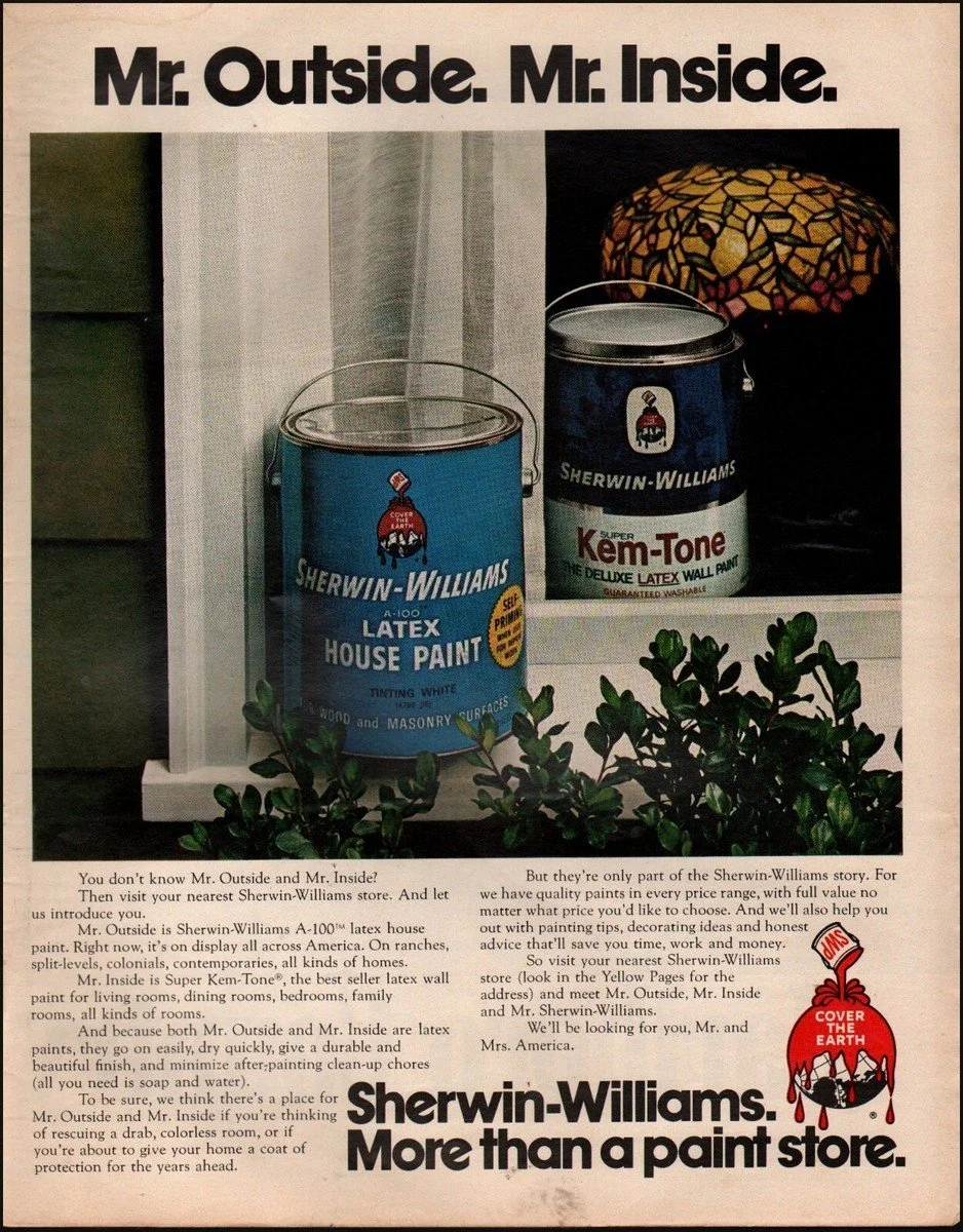
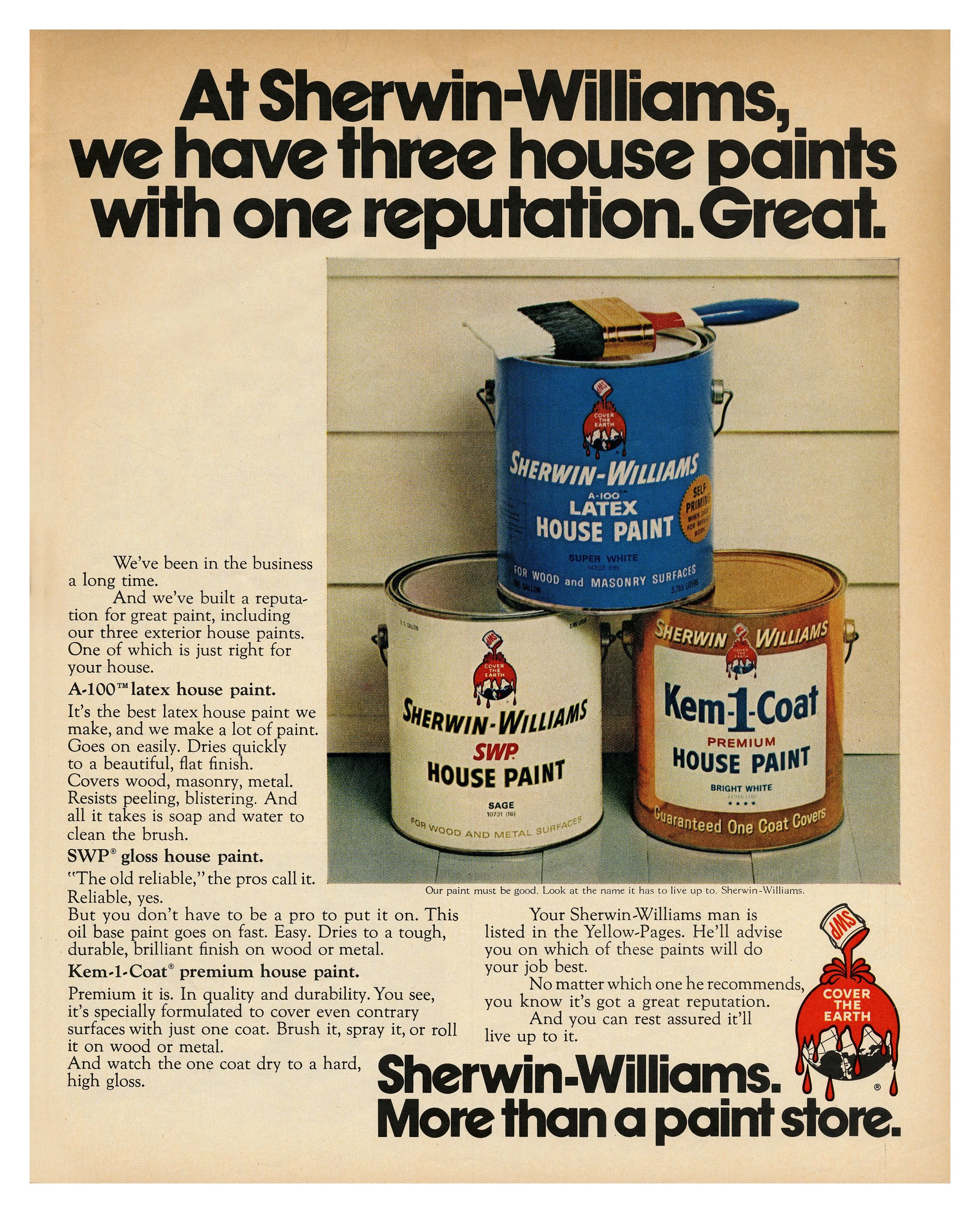
The Sherwin-Williams Cover the Earth logo is one of those designs. It’s everything that design school and modern branding tells us not to do: overly literal, overly detailed, and a bit strange. And somehow, that’s exactly why it endures.
Even though the illustration of paint pouring over the globe might feel heavy-handed by today’s minimalist standards, it has become, frankly, iconic. Everyone recognizes it, even without “Sherwin-Williams” printed beneath. It’s odd, it’s memorable, and it’s survived for well over a century.

What makes it so fascinating is how deeply it contradicts contemporary design principles. Today, we’re taught that the most successful logos should be stripped down to their barest essence — simple marks that can scale easily, live on screens, and blend seamlessly into digital ecosystems. While that is certainly important as we move forward in this digital age, and there’s a certain elegance in restraint, there’s also a risk: the more uniform and minimal everything becomes, the less soul it has. Logos begin to blur together. Especially in tech and lifestyle spaces, brands often chase whatever is trending rather than pursuing whatever is true to them.
That’s why Cover the Earth feels like such an anomaly — and quite refreshing, to be honest. It’s not afraid to be illustrative and a little eccentric. It was born in the early 1900s, when the world was shifting away from wallpaper and painted walls were beginning to transform homes. While the version we see today has evolved slightly from the original, the essence remains: it pays homage to its history while still standing proudly in the present.
There’s plenty of debate in the design community about whether it’s a “good” logo, objectively speaking. But I firmly believe the proof lies in its longevity. It hasn’t just survived design trends — it’s outlasted entire eras of visual language. It doesn’t chase relevance; it defines it through time, reminding us that a great logo isn’t about perfection or polish. It’s about conviction.
I think there’s something to be said for the way design can carry legacy, acting as a visual thread that connects people, eras, and values. The Cover the Earth logo has survived because it doesn’t apologize for being from another time: it leans into it. And that, to me, is what timeless design really means. It’s not about staying frozen in the past; it’s about staying grounded in purpose.

Minimalism certainly has its place — it pares things down to their essentials, allowing clarity and versatility, especially in a day where logos appear across numerous touchpoints. But sometimes, in the process of chasing refinement, brands lose their heartbeat. I think we’ve reached a point where minimalism has become less about intention and more about the fear of being too expressive, too emotional, too human. The industry’s obsession with simplicity often mistakes simplicity for sophistication.
That’s why I find so much beauty in design that endures, even when it defies convention. Such designs remind us that a logo doesn’t have to be trendy to be relevant, or flat to be functional. It just has to mean something. A logo like Sherwin-Williams’ tells a story bigger than aesthetics — it’s a statement about persistence, identity, and memory.
As a designer, that’s the kind of work I want to create. Not just something beautiful for now, but something that could still feel honest two decades from now. Timelessness isn’t about perfection; it’s about resonance. It’s when a design becomes so rooted in truth that even time can’t unseat it.
Maybe that’s why I’ve always been drawn to the idea of legacy in my own work. It’s not about grandeur or nostalgia, but about creating something that carries meaning — something that outlives trends and feels alive long after I’ve moved on to the next project. Because if design can leave even a small trace that lasts, that’s when it becomes more than just design. It becomes memory.
