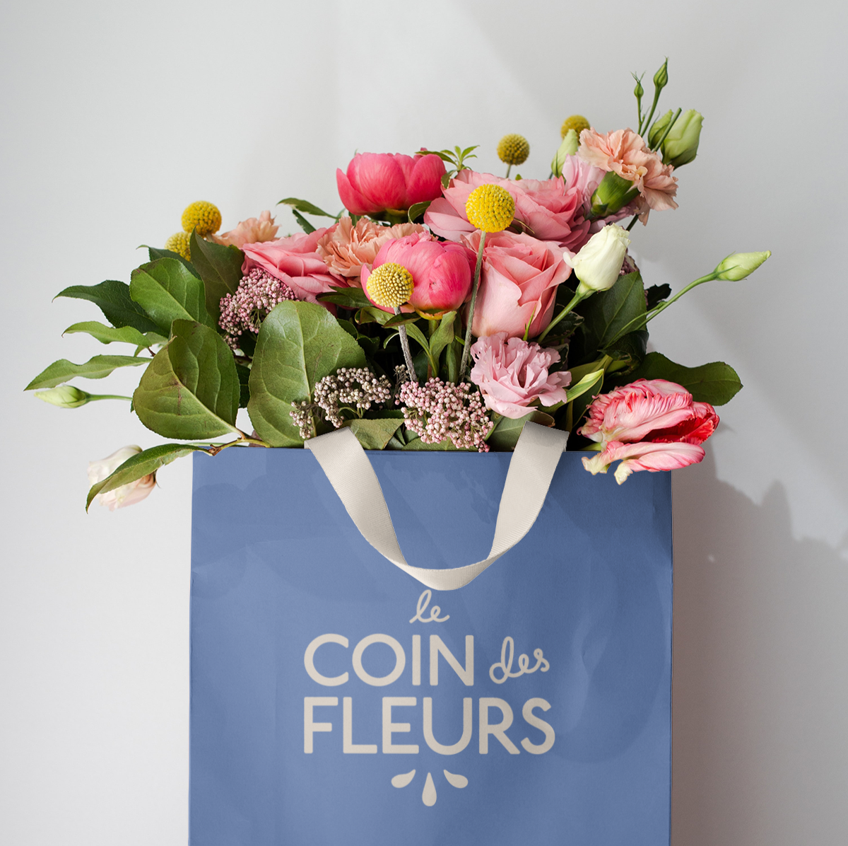
Le Coin des Fleurs
This was a conceptual brand identity for a French-inspired floral shop based in California. Le coin des fleurs translates to “flower corner,” which inspired the illustrated storefront logo — a playful nod to the boutique’s neighborhood charm.
My goal with this project was to merge elegance with approachability, creating a visual identity that felt both romantic and grounded. I customized a clean sans serif typeface and paired it with my own handwriting to create a sense of contrast and personality. The color palette — a rich French blue balanced by a warm cream — was chosen to evoke timeless sophistication while setting the brand apart from the typical pink-and-green floral aesthetic.
Altogether, the result is a cohesive and memorable brand concept that blends strategic design thinking with a sense of storytelling — the kind of identity that feels right at home on a sunlit corner.